Post-LD55: Trying not to suck at pixel art
Post-LD55: What to do with this game?
I had a blast doing Ludum Dare this time. I had a clear vision of the game from the get-go, and I think I managed to do everything I wanted. Granted, there were some things I would have done differently and there's never enough content in compo games anyway, but all in all, it went well enough.
Now... I have this prototype of a game. What to do with this?
Rough outline for the full game
I knew I wanted to do something bigger with the idea. After a short session of train-of-thought writing, I had the main story in place:
An evil wizard frog steals an ancient artifact and tries to take over the world. He renders the other wizard frogs powerless - all except our hero, an initiate who is tasked to stop the evil wizard.
But... What's it going to be like?
I started thinking about all my favorite platformer games. Most recently, I completed Super Mario Bros. Wonder, which I truly enjoyed, and I like the idea of levels being completable in multiple ways, depending on the active skill. Going back, Shovel Knight is another favorite of mine, with lots of references to my childhood.
Still, the greatest influence that comes to my mind is Mega Man, especially MM2 and MM3. These games were my jam as a kid, and I still think the non-linear approach of levels is amazing. I decided that I want to do something like that: let the player play the levels in any order they want.
After more writing and re-writing, I now have an outline of eight worlds, with four levels in each world, plus a tutorial level and a hub / town level. After the eight worlds, there will be the boss frog levels, which brings the total level count to about 38-40. Welp, that's a lot of levels to do!
A word about pixel art
I've never considered myself very good at any form of art, so my approach to pixel art is pretty much the same as with other art forms: throw stuff at the wall and see what sticks. But you know what? I think that's not enough.
While throwing stuff at the wall, I think it's crucial to know *what* to throw. For example, randomly picking colors isn't going to look good, no matter what you draw with them. Just take any sprite from any of your favorite games and randomly re-assign the palette. It will look awful. Vice versa, I think that you can get quite far with mediocre form as long as your palette is consistent.
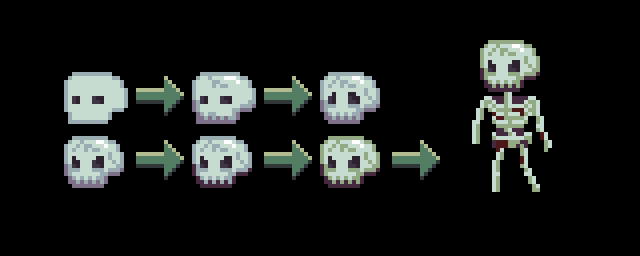
That said, pixel art is still quite time-consuming, at least for me. And what's worse, every single sprite follows the same pattern:
- Draw a crude shape
- "Oh no, this looks like poo"
- Fiddle around with the shape, add shading
- "Oh no, this still looks like poo"
- Somehow make it even worse by re-adjusting things around
- "I WILL NEVER GET THIS GAME DONE"
(This is depicted by the three first skulls in the image below.)
Then, something happens. It starts to look... decent enough. Some tiny change, like the eye holes, turns the whole thing around. Now the shape is taking its final form! After this, I start fiddling with the palette, trying out an alternate outline color, shading and main color. Here, I initially used a gray-ish color for the skull, but when adjusting the colors, I noticed that the more green-ish shades suited it much better.

What's next?
I've been trying to do progress on all fronts. Currently I'm blocking out the first world and designing the enemies and encounters in the first few levels. The image above might be a hint about the first world's theme...
Ritual of Ribbit
A Ribbity Adventure!
| Status | In development |
| Author | manabreak |
| Genre | Platformer |
| Tags | 2D, chiptune, Magic, Pixel Art, Retro |
| Languages | English |
| Accessibility | Configurable controls, Interactive tutorial |
Comments
Log in with itch.io to leave a comment.
Drawn quite a few skeletons myself in the past, yours is certainly not bad. Keep up a quality aesthetic.
Thanks a lot! Pixel art is still something I keep learning more and more. I think being self-critical is the only way to improve; if I can't see how a piece could be improved, I've plateau'd. :)